Philly Marathon is regarded as one of best for runners ranging from first timers to those highly experienced. It's very popular with thousands of spectators watching every year. That being said, it had an app with useful tools and information for both groups but was not very intuitive when navigating. The goal behind this app refresh was to address pain points and make improvements for the user experience.
Key Pain Points
Below is a list of negative aspects of the current app:
● Home page is too busy
● The U.I. and overall app design is outdated
● Finding info is not easy
● Lack of personalized experience for runner and spectator
● Logo is unreadable, too many things in a small area
Opportunity Workshop
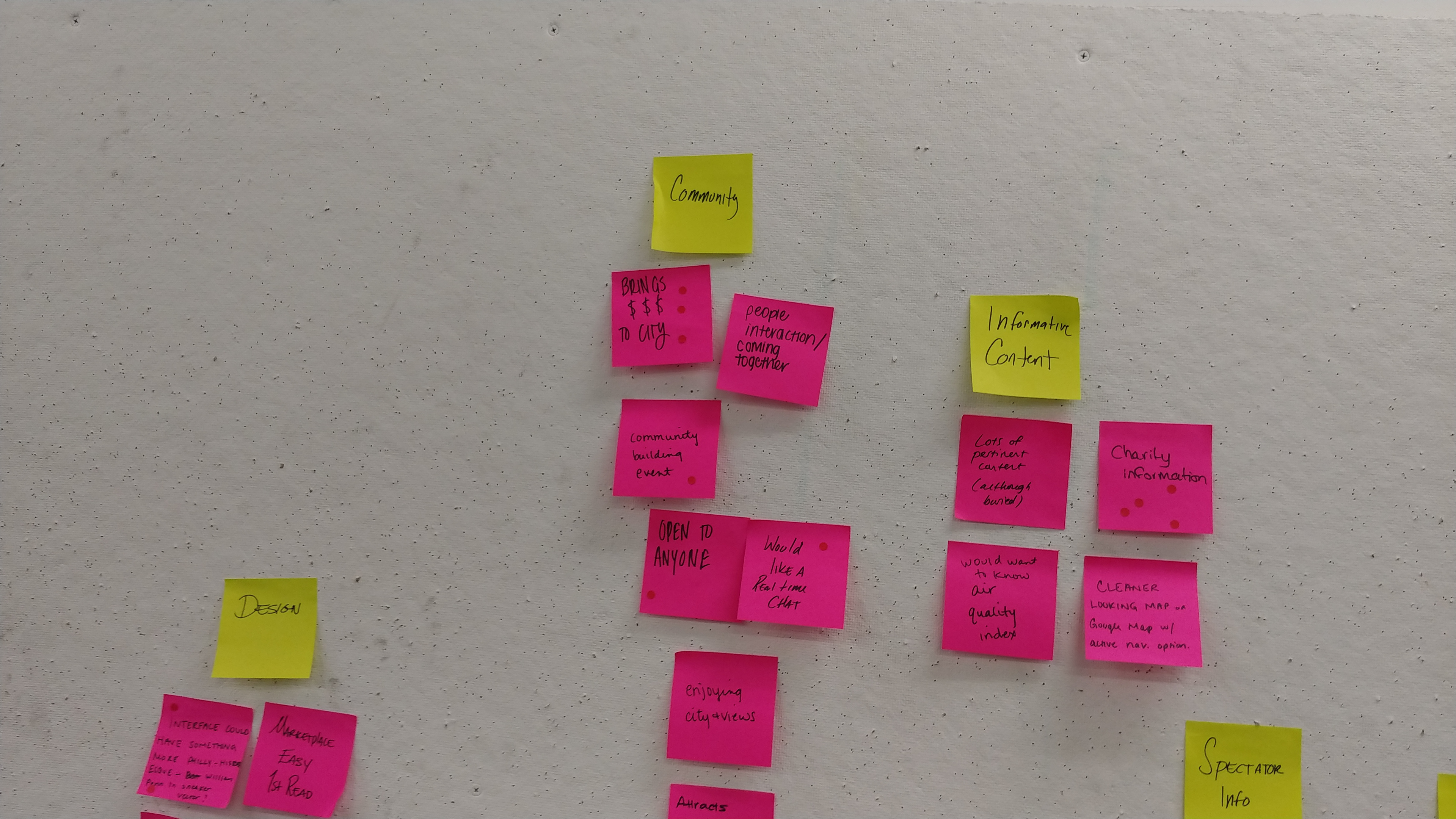
* Opportunity workshop notes board
During this workshop, the class read and reviewed comments by end users of the current app. We then downloaded and performed our own audit to confirm key pain points from user comments. We each created 2 lists, one for positive aspects of the app and one for negative. These were written on sticky notes (UXD's best friend) and placed on our pin board for review. Collectively, we grouped our notes into categories like Design and Functionality.
Using the board’s notes as a guide we sketched designs during timed challenges called “Crazy 8’s”. Sketching helped us work through our concepts and ideas for our screen designs.
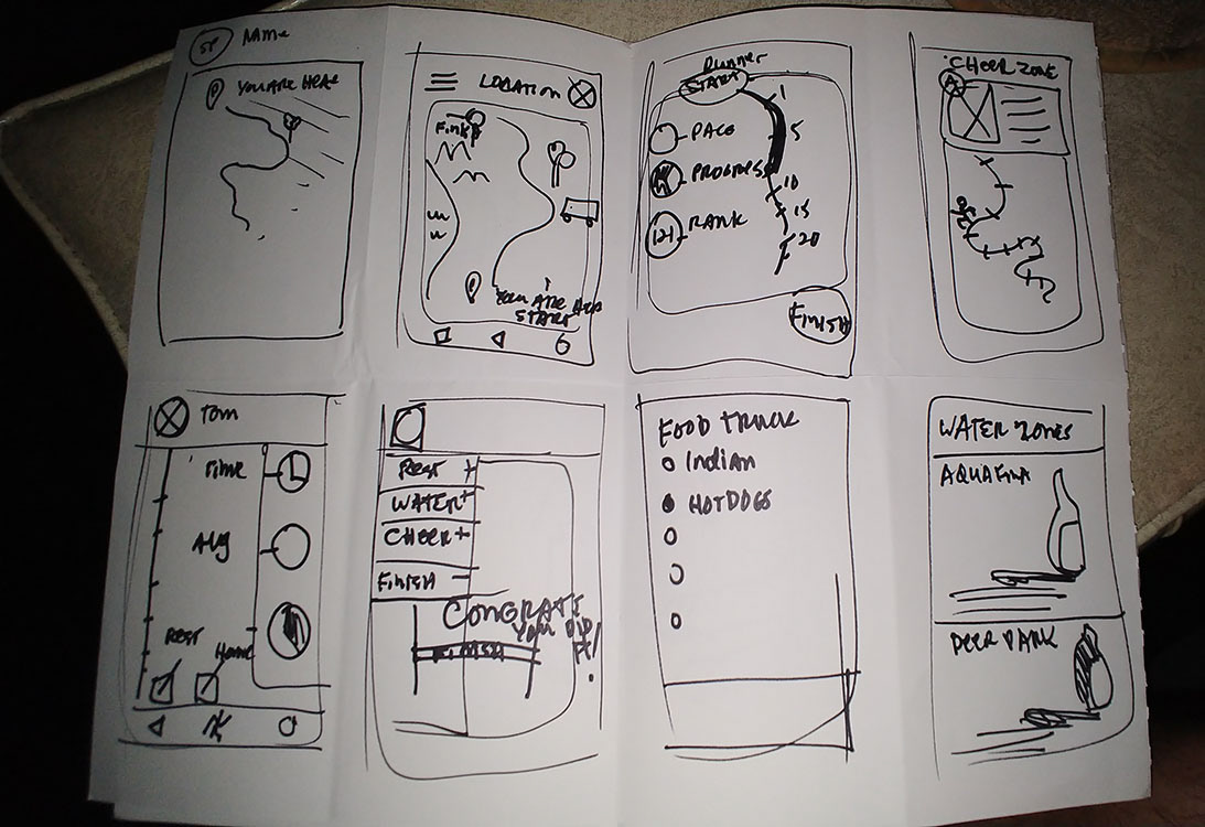
* Crazy 8’s sketches
Project Brief
Business Goals
The business goal for this app is to have an increase of downloads from the 2017 app and continued use from the end user.
Another business goal is to earn monetary profits through purchases from the Marathon Merchandise e-commerce store and paid advertisements from local business and corporate
sponsorship.
User Goals
The user goal (Runner and Spectator) is to have a great experience and continued use of the
app.
app.
Strategy
The strategy to accomplish both the Business Goal and User Goal is to create a unique app with features and information that meet / exceed expectations of users competing or spectating
the 2018 Philadelphia marathon. The features and information are listed below.
- Calendar events / Marathon timeline
- Race day live tracking of runner. (Only accessible by Runner invitation)
- Course Maps
- Cheer zones
- Online store
- Fundraising/ Donation portal
- List of Sponsors
- Volunteer Registration information
Proto Personas and User Flow Maps
Disclaimer
The proto personas in this case study were well thought out and work well with this version of the case study. More research would be performed if this was a production app.
The proto personas in this case study were well thought out and work well with this version of the case study. More research would be performed if this was a production app.
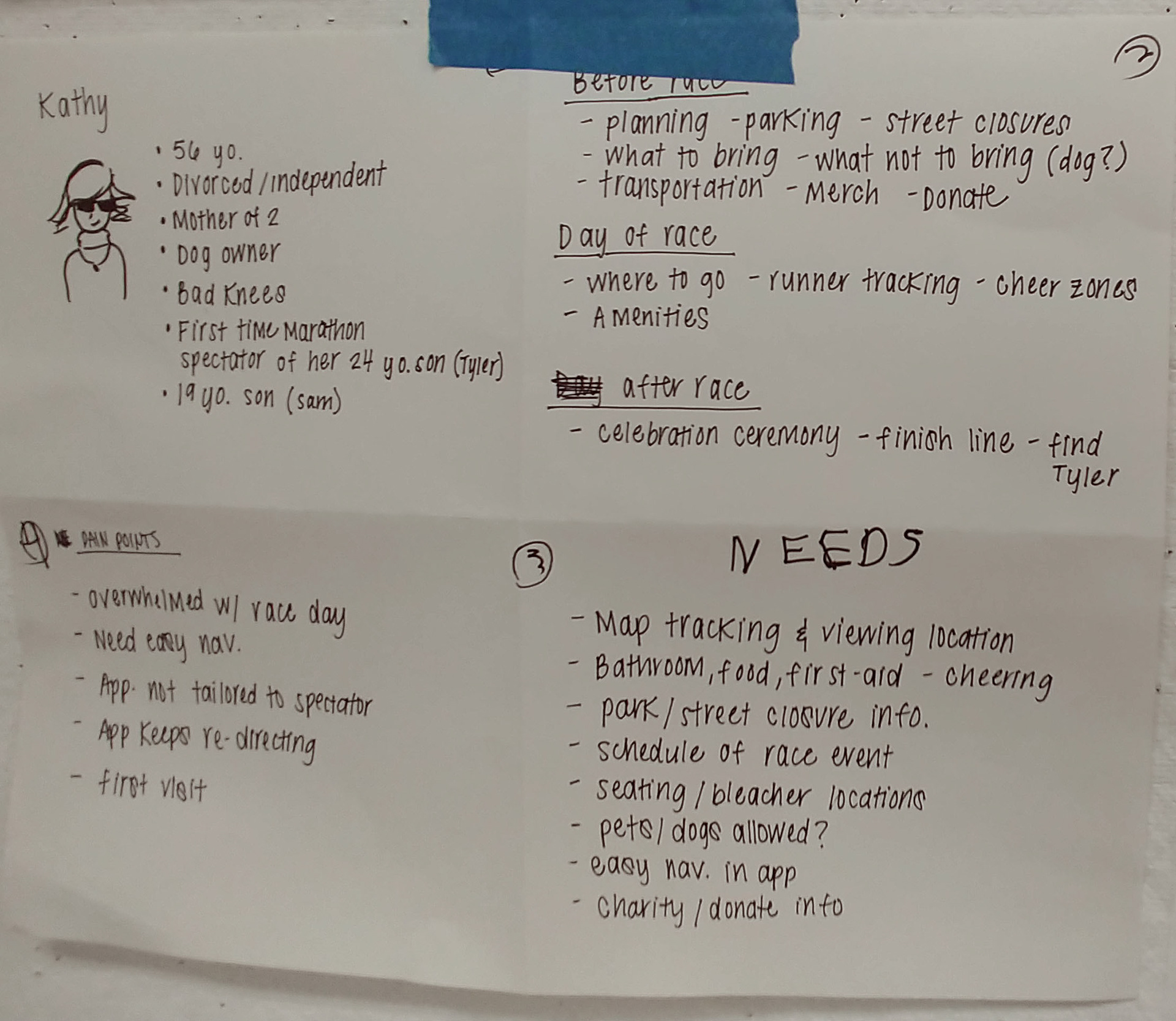
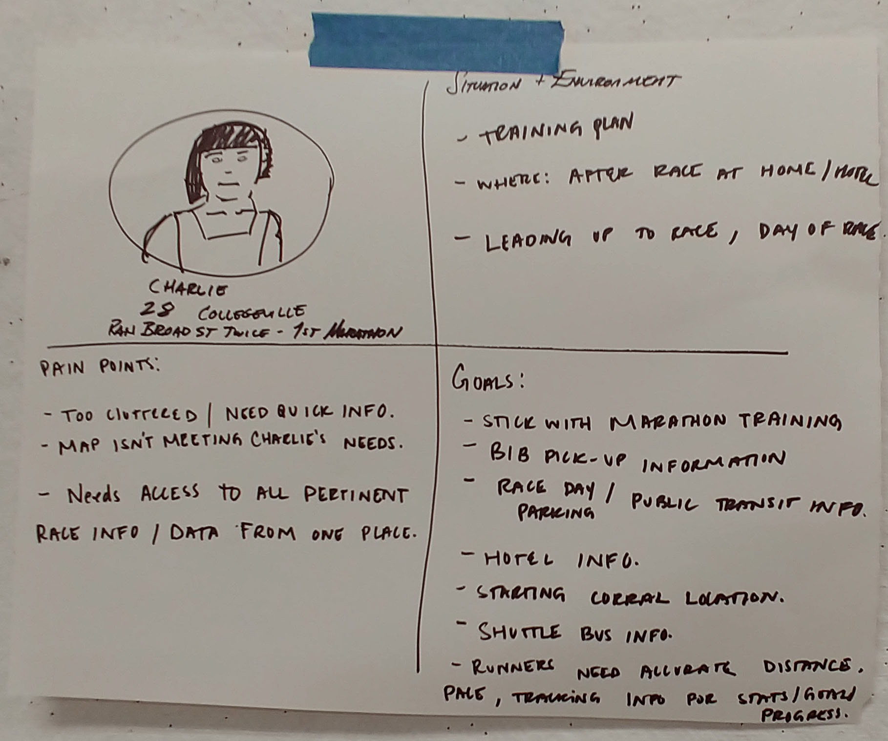
*Image on left is Kathy’s Persona. On the right is Charlie’s persona.
Proto Personas and User Flows
Charlie and Kathy are the personas for this case study. Charlie is a runner is his 20's and is very familiar with operating smart devices. Kathy is a spectator; her son is participating in the marathon. She is also very familiar using smart devices.
These Proto Personas factored in runners age, daily activities, marital status, their dwelling, and familiarity with Philadelphia.


* Kathy user flow map.
Execution
A combination of drawing sketches, participating in design thinking workshops, and presenting low fidelity mockups was done to execute my final prototype.
The new logo is easy to read logo and carries over the runner’s shoe from the old logo but with my take on it. I decided to make it solid, sharp, and edgy. This is in contrast to the original one below that has curvy contour lines.

*My new logo
My screen designs are custom and personalized to Charlie the runner and Kathy the spectator. The screens I focused on are Race Day related screens for Charlie and Pre-Race screens for Kathy. I used different color themes to differentiate them from each other. They share the same U.i. but have slightly different functions specific to their needs. For instance the top left icon on Race Day Charlie ‘s dashboard has “Race times” while Pre Race Kathy has a “Plan” her day menu.

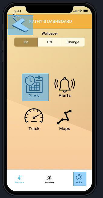
*The blue boxes on top of the icons are hot spots from my inVisionApp Prototype.
I made permission requests and motivational screens before you dive into the app’s main features. Why? By gaining access granted upfront, the user would have a better experience. No longer would they be annoyed by constant pop ups as they navigate through the app.
The goal for the teaser motivational message and image goal was to inspire curiosity of the app.
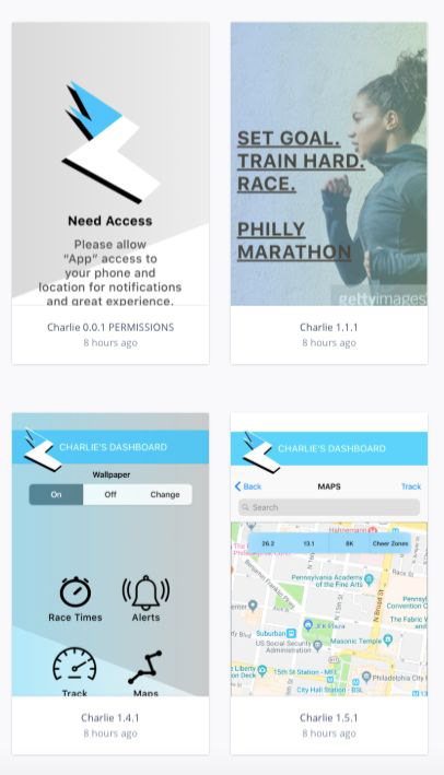
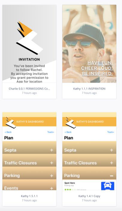
* Screen displays from inVision.
Conclusion/Takeaways
Pain points were address and the user experience was improvement with a redesigned intuitive U.i.
If I were to make another iteration, I would have focused my effects to creating more personalization and customization features. These would of included integration with wearable devices, dashboard with runners stats, and engagement with followers.